What Colors Should Be Preferred in CV Design?

The choice of colors in CV design should vary depending on the nature of the position applied for and the industry. For instance, in traditional sectors such as finance or law, darker and more serious colors are preferred, while in creative industries, bolder and more vibrant colors can be used. Colors like black, gray, and navy convey a message of seriousness and professionalism, whereas bright colors like orange, blue, and green can create a sense of creativity and dynamism. Achieving this balance will enhance the impact of your CV.
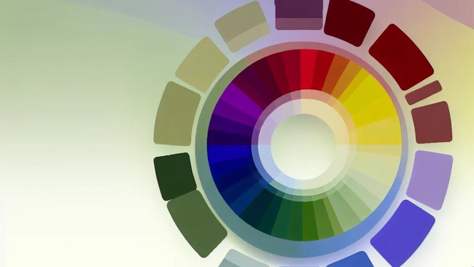
The psychological effects of colors should also be taken into account. For example, blue and green represent peace and balance. If the position you are applying for requires leadership, strong colors like red may be preferred. Additionally, it is important to choose a primary color and add complementary colors to ensure color harmony. This way, you can create an aesthetically pleasing image and convey your message more effectively.
- Dark colors: Black, navy, gray (for seriousness)
- Vibrant colors: Orange, red, green (to enhance creativity)
- Pastel tones: Light blue, pink (for a soft expression)
- Complementary colors: Colors that complement the primary color (to achieve balance)
Moreover, paying attention to the harmony of colors is also important. Color combinations can affect the overall appearance and readability of your CV. Using too many colors can be distracting and may reduce the clarity of your message. Therefore, starting with 2-3 primary colors and using them in different areas will provide both professionalism and an aesthetic appearance. Choosing appropriate color palettes will make your CV more attractive in the eyes of potential employers.
Color Psychology: What Does Each Color Mean?
Color psychology is an important factor that influences people's emotions, thoughts, and behaviors. Especially in CV design, the choice of colors plays a significant role in reflecting the applicant's personality and professionalism. For example, blue signifies passion and energy. Therefore, when deciding which color to choose, you should consider your target audience and the message you want to convey.
The color green is known as a symbol of nature and tranquility. It creates a calming effect on people, evoking feelings of balance and peace. This means that using green in a CV can effectively highlight qualities such as harmony and teamwork in the position being applied for. Thus, shades of green should be preferred in environmentally friendly and sustainable industries.
Yellow symbolizes creativity and optimism, standing out as an attention-grabbing color. This color is particularly suitable for creative professions. However, it should be used in a balanced way, as excessive use can lead to distraction. Shades of yellow can radiate positive energy, helping the applicant to showcase an energetic and creative personality.
Lastly, black and white colors offer a classic and timeless appearance. Black is perceived as a symbol of authority and power, while white represents purity and cleanliness. The combination of these two colors is ideal for creating a serious and professional image. Especially in corporate sectors, the use of these colors can enhance the applicant's seriousness and professionalism.
How to Create Professional Color Combinations?
Creating a professional CV design involves selecting the right color combinations. Considering the psychological effects of colors, the colors you choose can leave a significant impression on potential employers. For instance, shades of blue symbolize reliability, while shades of green represent innovation and creativity. Therefore, it is crucial that the color combinations you use in your CV reflect your personal brand image and are suitable for the industry you are targeting.
Another important aspect to consider when creating color palettes is the harmony between colors. Using complementary colors from the color wheel can add visual balance to your design. For example, contrasting colors like blue and orange or green and pink complement each other to create an eye-catching appearance. Additionally, bringing similar shades together can achieve a softer and more professional look. Such combinations are especially preferred in traditional industries.
- Blue and gray: Ideal for a reliable and professional impression.
- Green and white: Gives a sense of cleanliness and innovation.
- Brown and beige: Provides a warm and friendly appearance.
- Red and black: Symbolizes power and determination.
Finally, when creating your color combinations, you should not forget your target audience and your industry. While bolder and more vibrant colors may be preferred in creative industries, more muted and classic color palettes might be more appropriate in traditional sectors like finance or law. Additionally, the colors used in your CV should be harmonious with the font and layout. By considering all these elements, the color combinations you create will enhance the professional appearance of your CV and set you apart from other candidates.
Color Options: Which Colors for Which Fields?
In CV design, color selection is of great importance depending on the nature of the position applied for and the character of the industry. For example, vibrant and dynamic colors should be preferred for someone looking to work in a creative sector. Colors like blue, green, or orange can attract attention by radiating positive energy. However, in more traditional sectors like finance or law, more serious and professional colors such as white, gray, and navy blue should be preferred. The choice of color should reflect personality and professionalism in the best possible way.
For individuals working in the technology field, shades of blue convey a sense of reliability and professionalism, while shades of green symbolize an innovative and eco-friendly approach. Additionally, the use of white and green in the healthcare sector represents cleanliness and safety. In the education sector, pastel tones can create a sense of warmth and friendliness, leaving a positive impression about candidates. The impact of colors can directly affect the perception of your target audience, making it critical to make the right choices.
The colors used in job interviews or professional environments play an important role in shaping the applicant's personal brand. Especially on platforms like social media and LinkedIn, the colors used can give insight into the candidate's personality. For example, a candidate using bold and eye-catching colors may be perceived as confident and innovative. However, it should be noted that excessive use of color can be distracting and overshadow the candidate's competencies.
Lastly, it should be remembered that color combinations need to be harmonious. For instance, contrasting colors like blue and orange can be used together, while similar tones like white and gray can create a more simple and elegant appearance. How colors are combined should also contribute to the overall design and message of your CV. Being careful in color selection can help your application stand out and leave a lasting impression on potential employers.
Mistakes to Avoid When Using Color in Your CV
One of the most common mistakes in CV design is resorting to excessive use of color. Overuse of colors can detract from the professionalism of your CV and lead to distractions. Bright and eye-catching colors, in particular, can strain the reader's eyes and cause important information to be overlooked. Therefore, keeping your color palette limited and selecting only a few harmonious colors can significantly enhance the overall appearance of your CV.
Another common mistake is ignoring the psychological effects of colors. It is important to consider that different colors evoke different emotions. For instance, while blue represents trust and loyalty, red conveys urgency. Thus, it is crucial to be careful in your choice of colors for your CV and to think about the message you want to convey. In addition to being bold and eye-catching, your color choices should also align with your purpose.
Moreover, mistakes regarding color harmony should not be overlooked. How colors interact with each other and which combinations provide a pleasing appearance are very important. For example, using light colors on a dark background usually yields positive results, while combining contrasting colors can create a striking effect. However, excessive use of such combinations can disrupt the overall vibe of your CV.
Finally, using colors that do not reflect your personal brand is also a mistake. Your CV should represent your professional identity. If you work in a specific industry, you should consider the color trends of that sector when making your choices. For example, bolder colors may be preferred in creative industries, while more conservative and simple colors should be highlighted in corporate sectors. This not only strengthens your personal brand but also helps you align with other professionals in the industry.
How Do Colors Affect the Readability of a CV?
The impact of colors on a CV is crucial for readability. The contrast of colors determines the relationship between the text and the background. High-contrast color combinations help the reader perceive the text more easily. For instance, black text on a white background is easier to read, while blue text on a yellow background can be challenging. Therefore, choosing appropriate color combinations enhances the professional appearance of your CV and makes it more eye-catching.
At the same time, the colors in your CV have the ability to
The psychological effects of colors are another factor that influences CV readability. For example, blue and green can evoke a sense of freshness and balance. Such psychological effects can shape employers' first impressions of you. Evaluating the meanings of colors well can not only enhance the impact of your CV but also help reflect your personality.
Finally, excessive use of colors can reduce readability. Too many colors or complex combinations can distract the reader and make it difficult to understand the text. Therefore, achieving a simple and elegant look by using fewer colors enhances readability. The effective use of colors not only makes your CV visually appealing but also helps you convey your content effectively.
Color Trends in CV Design: What's Popular in 2023?
The popular color trends in CV design for 2023 are particularly shaped around minimalism and natural tones. Candidates seeking a simpler and more elegant look are opting for pastel color palettes. Pastel shades are among the options that are easy on the eyes and create a professional impression. Colors like light blue, mint green, and lavender are commonly used in CVs. These colors reflect the candidates' personalities while also leaving a positive impact on employers.
Another striking trend in 2023 is the use of vivid and bold colors. Especially those working in creative industries prefer bolder colors to stand out. Bright colors like red, orange, and yellow leave a strong impression and help candidates express themselves. However, using these colors requires a careful balance; instead of overdoing it, highlighting these colors in specific sections makes the overall design of the CV more effective.
Additionally, natural color palettes are another trend that stands out in 2023. Earth tones, greens, and blues emphasize the candidates' connection to nature. These colors not only present a professional stance but also add a warm atmosphere. Nature-inspired colors can be a highly effective choice, especially for those working in environmentally friendly or sustainability-focused sectors. This way, candidates can also demonstrate their environmental awareness to employers.
Lastly, monochromatic combinations are another popular trend in 2023. Using different shades of a single color creates a stylish and harmonious look in the CV. Monochromatic designs typically offer a simple and modern appearance, highlighting the professionalism of candidates. Such designs are particularly favored in corporate job applications. The most important point to consider in color selection is to always prioritize readability and ensure that the colors are harmonious with each other.