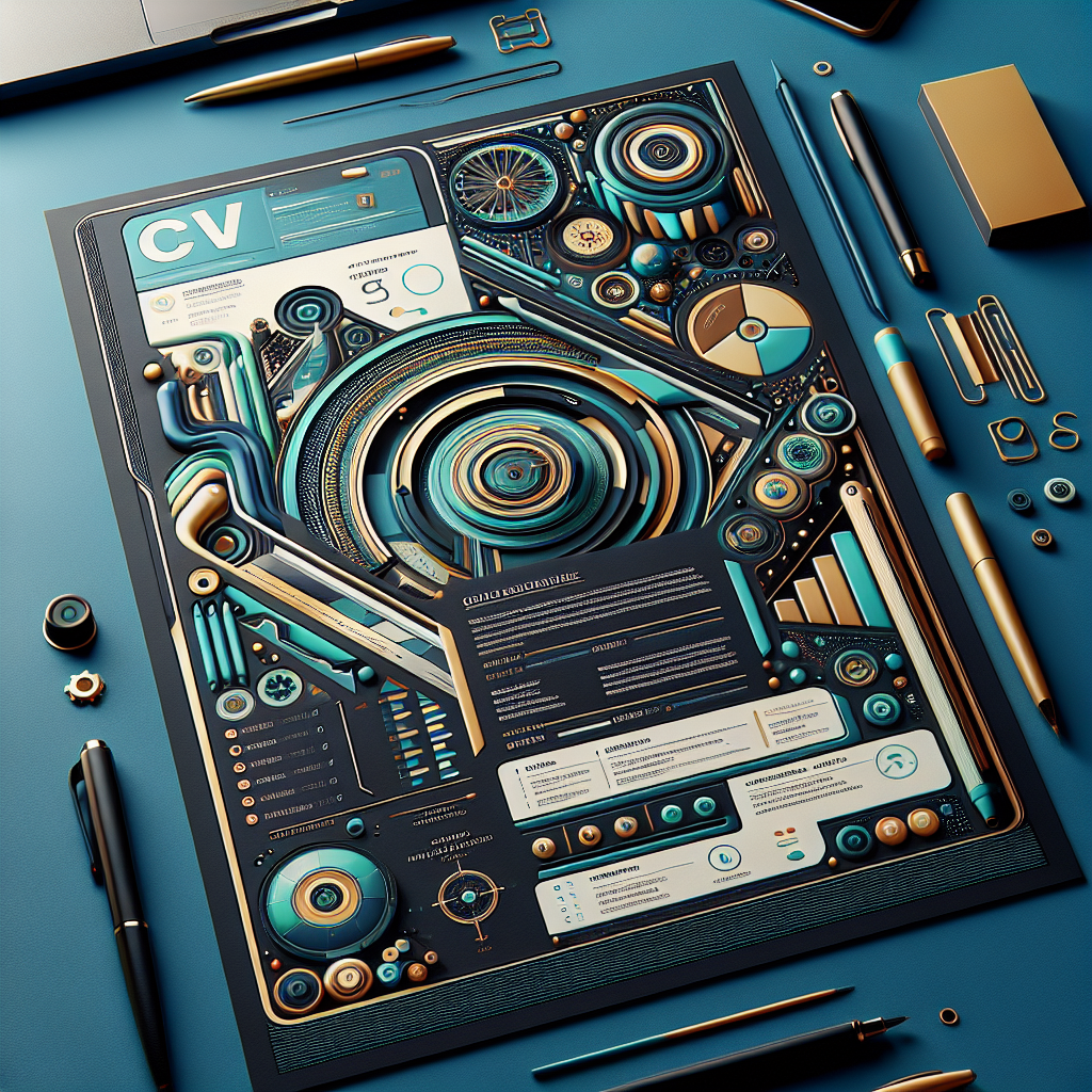
In today’s competitive job market, the days of conventional, monochrome CVs are numbered. To capture the attention of prospective employers, it’s essential to infuse creativity into your CV design. This post will guide you through the art of crafting a standout CV by exploring the significance of creative design elements, such as colour schemes, infographics, and typography, while maintaining a balance between creativity and professionalism.
Understanding the Importance of Creative CV Design
The way you present your CV can profoundly impact how potential employers perceive your application. A creatively designed CV does more than just display your qualifications and experience; it communicates your personality, attention to detail, and your ability to think outside the box. But why exactly is creative CV design so important?
Firstly, consider the sheer volume of CVs that hiring managers review daily. With piles of documents to sift through, a visually appealing CV can instantly grab attention and make your application memorable. Creative elements can help highlight your strengths and achievements, ensuring they don’t get lost in the sea of text that typically characterises traditional CVs.
Another critical aspect of creative CV design is its role in reflecting your personal brand. Just as companies use branding to differentiate themselves in the market, your CV can serve as a personal marketing tool. By incorporating unique design elements, you can convey your professional identity and values effectively, which might resonate with the company’s culture and ethos.
However, creativity should not overshadow clarity and readability. The ultimate goal of a CV is to communicate your qualifications and experience clearly. Thus, while a creative approach can make your CV stand out, it’s important to ensure that it remains easy to read and understand. This requires a balanced mix of creativity and functionality, ensuring that your CV not only catches the eye but also effectively conveys the necessary information.
In conclusion, creative CV design is not merely about making your document look pretty. It’s about strategically using design elements to enhance readability, reflect your personal brand, and make a lasting impression on potential employers. As you progress through this guide, you’ll learn how to choose the right colour schemes, incorporate infographics, and use fonts and typography effectively, all while maintaining a professional tone.
Choosing the Right Colour Schemes for Your CV
When it comes to crafting a compelling CV, the right colour scheme can make all the difference. Not only does it contribute to the aesthetic appeal, but it also plays a crucial role in conveying your personality and professionalism. In this section, we’ll explore how to choose colour schemes that enhance your CV without overwhelming it.
Understanding Colour Psychology
Colours have the power to evoke emotions and convey messages. Understanding basic colour psychology can help you choose the right tones for your CV:
- Blue: Often associated with trust and professionalism, making it a safe choice for many industries.
- Green: Conveys growth and stability, suitable for fields related to finance or environmental sciences.
- Red: A bold choice that can signify passion and energy, but use with caution as it can also be perceived as aggressive.
- Grey: Neutral and balanced, ideal for maintaining a clean and professional look.
Crafting a Cohesive Design
When selecting colours, aim for a cohesive design that complements your personal brand. Here’s how:
- Limit Your Palette: Stick to two or three complementary colours to maintain a clean and professional appearance.
- Consider the Industry: Different industries have varying expectations. Creative fields may welcome more vibrant colours, while traditional sectors prefer muted tones.
- Ensure Legibility: Contrast is key. Ensure that text is easy to read by using dark text on light backgrounds or vice versa.
Testing and Feedback
Before finalizing your CV, test your colour scheme by printing a copy or viewing it on different screens. Seek feedback from peers or mentors to ensure your CV is both eye-catching and professional. Remember, your CV is a reflection of you, so let your personality shine through with a well-chosen colour palette.
By carefully selecting your CV’s colour scheme, you can craft a document that not only stands out but also effectively communicates your personal brand to potential employers.
Incorporating Infographics to Highlight Key Achievements
In the competitive job market, standing out with a visually appealing CV can make all the difference. One effective way to achieve this is by integrating infographics into your CV design. Infographics are not just visually stimulating; they are also a powerful tool for communicating key achievements and skills succinctly.
Why Use Infographics in Your CV?
Infographics can transform how your CV is perceived by potential employers. They provide a snapshot of your qualifications and accomplishments, making it easier for recruiters to quickly grasp your value proposition. Here are a few reasons why infographics are beneficial:
- Visual Appeal: Infographics break the monotony of text-heavy CVs, catching the eye of the reader.
- Clarity: They distill complex information into digestible, bite-sized visuals, making your achievements clearer.
- Memorability: A visually engaging CV is more likely to be remembered by hiring managers.
How to Incorporate Infographics
Designing an infographic-based CV doesn’t require you to be a graphic designer. Here are some tips to help you get started:
- Identify Key Achievements: Pinpoint the most important milestones in your career. This could be sales targets met, projects completed, or awards received.
- Select the Right Visuals: Choose graphical elements that suit your achievements. For instance, use bar graphs for sales figures or pie charts for skill proficiency levels.
- Keep It Simple: Avoid clutter. An infographic CV should be clean and concise, focusing on the most impactful data.
Examples of Effective Infographics
| Type | Use Case |
|---|---|
| Bar Graph | Showcase annual growth in sales or performance. |
| Pie Chart | Illustrate the distribution of skills or time spent on various projects. |
| Timeline | Highlight career progression and key milestones. |
By incorporating infographics, you can create a dynamic and engaging CV that captures the attention of employers and effectively communicates your professional journey. Embrace the power of visuals and make your CV a standout document in any job application process.
Using Fonts and Typography to Enhance Readability
In the competitive job market, having a visually appealing and easily readable CV can make a significant difference. While content is king, the way your CV is presented can greatly affect its impact. One often overlooked aspect of CV design is the use of fonts and typography to enhance readability and convey professionalism.
Choosing the Right Font
When selecting a font for your CV, it’s crucial to strike a balance between style and readability. Opt for fonts that are clean and professional. Some popular choices include Arial, Calibri, and Times New Roman. These fonts are known for their simplicity and clarity, making them ideal for ensuring your CV is easy to read.
Consider using serif fonts like Georgia for headings to create a classic look, while sans-serif fonts like Helvetica can offer a modern touch for the body text. The key is to maintain consistency throughout the document.
Effective Use of Font Sizes
The size of your font plays a crucial role in readability. Your name at the top of the CV should be the largest text on the page, typically sized between 18-24 points. For section headings, use a slightly smaller size, around 14-16 points, to maintain a clear hierarchy. The body text should be around 10-12 points, ensuring that it is comfortable to read without straining the eyes.
Leveraging Typography for Emphasis
Typography isn’t just about choosing a font; it’s about using bold, italics, and colour effectively to highlight important information. Use bold text sparingly for section titles and critical achievements. Italics can be used for less critical information like dates or locations.
Whitespace and Line Spacing
Don’t underestimate the power of whitespace. Adequate spacing improves the overall readability of your CV. Maintain a line spacing of 1.15 to 1.5 to avoid a cluttered appearance. Use margins and padding to give your CV a clean, professional look.
Consistency is Key
Finally, ensure consistency across your CV. Stick to one or two fonts and maintain uniformity in font sizes and styles. Consistency in typography reflects attention to detail and professionalism, qualities that employers highly value.
By thoughtfully selecting fonts and employing strategic typography, you can create a CV that not only stands out but also effectively communicates your qualifications and experience. Remember, a well-designed CV is a powerful tool in your job-hunting arsenal.
Balancing Creativity with Professionalism in CV Design
In today’s competitive job market, making your CV stand out is crucial. While content remains king, the design of your CV can significantly impact the first impression you make on potential employers. It’s essential to strike a balance between creativity and professionalism to ensure your CV is both eye-catching and appropriate for the industry you’re targeting.
Understand Your Industry
Before diving into creative design elements, consider the norms of your industry. Creative fields like advertising or graphic design might welcome bold designs, whereas more conservative fields like finance or law may prefer a more traditional approach. Tailoring your CV’s design to align with industry standards demonstrates an understanding of your field.
Incorporate Visual Elements Wisely
Visual elements can enhance your CV, but they should never overshadow the content. Here are some tips for incorporating visuals:
- Colours: Use a limited palette to add subtle accents. Stick to two or three colours that complement each other and ensure text readability.
- Fonts: Choose clear, professional fonts. Mixing fonts can add visual interest, but limit yourself to two to maintain clarity.
- Icons and Graphics: Use icons to highlight sections or skills, but keep them minimal to avoid clutter.
Utilise White Space
White space is your friend. It helps break up text and makes your CV more readable. Avoid cramming too much information into a small space, which can overwhelm the reader.
Highlight Key Information
Use bold or italics sparingly to draw attention to critical sections, such as your achievements or key skills. This will help ensure that important information doesn’t get lost.
Consider Layout and Structure
Organize your CV in a logical order. Start with the most relevant sections, such as your personal statement or work experience, and follow with supporting information like education and skills. A well-structured CV makes it easier for employers to find the information they need.
By thoughtfully incorporating creative design elements into your CV, you can make a lasting impression while maintaining the professionalism required in your industry. Remember, the goal is to enhance your content, not detract from it.
Leave a Reply